The company announced to change its default font via an official blog post. In the post, Microsoft states that it is time that we evolve and use a brand new default font across its apps and services. As a result, the software giant commissioned five new custom fonts, out of which one will replace Calibri as the default font. As per Microsoft, the new custom fonts expand the various sans-serif styles such as humanist, geometric, swiss-style, and industrial. Moreover, they are made by dedicated designers, which makes each of the new fonts unique in its own way.
The Next Default Font for Microsoft
Now, the names of the new fonts are also pretty catchy and they are Tenorite, Bierstadt, Skeena, Seaford, and Grandview. So, let us take a look at them individually, shall we?
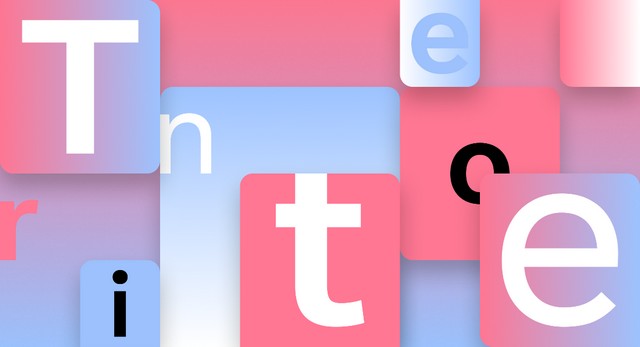
Tenorite by Erin McLaughlin and Wei Huang
Tenorite is the first contender to replace Calibri and has a traditional “workhorse sans serif (a font without a serif, or a stroke at the ends, like Times New Roman)” look. However, it has a more friendly, warmer style, creating a “generally open feeling.”
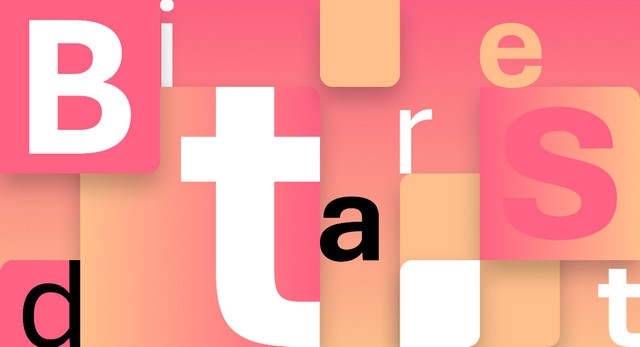
Bierstadt by Steve Matteson
The second contender, Bierstadt is similar to the sans serif typeface and takes inspiration from the mid-20th-century Swiss typography. It has a versatile typeface that, as per Microsoft, “expresses simplicity and rationality in a highly readable form.”
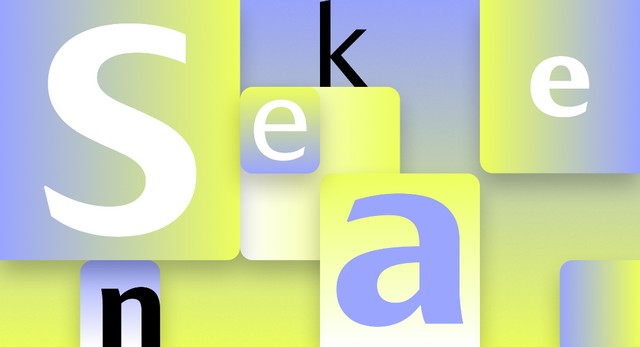
SKEENA by John Hudson and Paul Hanslow
Skeena is essentially a “humanist” sans serif that takes cues from the traditional serif text typefaces. It has a unique stroke design that delivers a striking contrast between thick and thin. Moreover, there is a distinctive slice applied towards the end of each letter. It is an ideal font for body text in long documents and shorter passages in tables, reports, ad brochures.
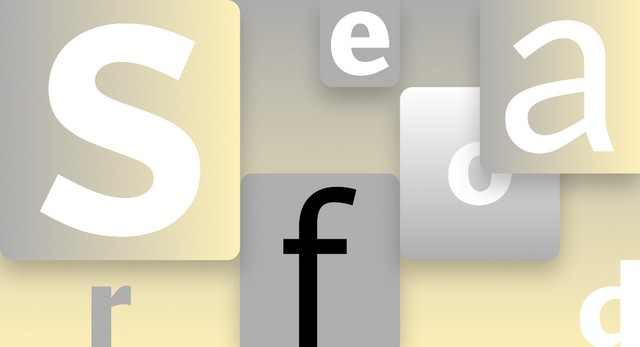
SEAFORD by Tobias Frere-Jones, Nina Stössinger, and Fred Shallcrass
Now, Seaford is a sans serif typeface that comes from the roots of the old-style serif text typefaces. It features a familiar design with its organic and asymmetric form and emphasizes the differences between letters to create more recognizable word shapes.
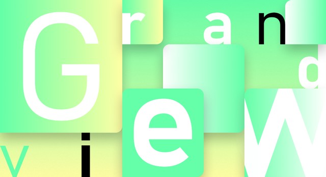
GRANDVIEW by Aaron Bell
Lastly, Grandview is a sans serif typeface that comes from classic German road and railway sign fonts. The sign fonts were specifically designed to make them readable from a distance, and in poor lighting conditions, and Grandview carries a similar design. So, as per Microsoft, Grandview is ideal for body text.
How to Choose the Next Default Font for Microsoft?
One of these five new fonts will replace Calibri soon. Now, the company wants your feedback and votes to choose the next default font for its apps and services. Microsoft recently shared a tweet (attached below) to connect with users and acquire their feedback. So, you can comment the name of your favorite font on this Twitter post to let Microsoft know about your preference. The company says that even if it does not choose your favorite font as the next default font, all the new fonts. including the old-default Calibri. would still be there in your arsenal inside the Microsoft Office and 365 apps.
— Microsoft (@Microsoft) April 28, 2021 So, which of the five fonts do you want to become the next default font for all things Microsoft? Let Microsoft and us know about your thoughts!
